Speed is the killer feature
Feb 25, 2021
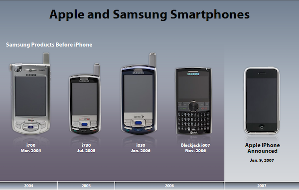
Do you remember your first time using a modern smartphone? A vibrant screen that responded instantly when you tapped replaced cramped keyboards. You could sign your name, drag and drop apps around the screen, and even spin the giant Price is Right wheel to set your alarm. In 2007, this felt like a the future. There's a reason it was called 'the Jesus phone.'
At that same time, The Motorola Razr (video) was the top phone on the market. It was a flip phone with the ability to take photos, play videos, browse the web, and play music. Sound familiar?
Phones in 2007 had the same features as the iPhone. The Palm Treo (video) even had a touch screen.

The difference was speed.
When you touched a Razr or a Palm phone, there was a delay. It felt sluggish and slow. Apple removed the delay between your finger tapping the screen and something happening. Your finger could finally manipulate the UI in realtime, just like in the real world. It felt magical. If there was even a slight delay, the whole experience fell apart.
Speed is a killer feature. Speed is a differentiator.
Yet teams consistently overlook speed. Instead, they add more features (which ironically make things slower). Products bloat over time and performance goes downhill.
New features might help your users accomplish something extra in your product. Latency stops your users from doing the job they already hire your product for.
Slow ui acts like tiny papercuts. Every time we have to wait, we get impatient, frustrated, and lose our flow.
Honestly assess your speed
I want you to take a moment and approach your product with a fresh set of eyes: Eyes for speed 👀
Go through your onboarding flow and try your core product features. Take mental note of how long each step takes to appear on the page then to be interactive.
How slow is it? Be honest. It’s ok, I’ve been there too.
Does your checkout page take 10+ seconds to load? Did you have to wait for a loading indicator multiple times along the way? Did things look interactive but weren’t loaded yet?
Every one of these is an opportunity. The great thing about speed (also called ‘performance’) is that you can stack rank it and burn it down.
Imagine what your product would feel like if everything happened in real time.

Be like Keanu and fix every slowdown in your product. Your users will thank you.
Places where speed matters
- Speed during Checkout - Every second of page load time kills conversion rates. A 1 second delay reduces conversion rate by 7%.
- Framerate in Virtual Reality - The early days of Virtual Reality caused intense nausea akin to motion sickness when framerates dropped below 60fps.
- Design Tools - Users are consistently frustrated when Sketch or Figma are slow. Designers have high APM (actions per minute) and a small slowdown can occur 5-10 times per minute.
- The core interaction of your product - Your product exists to save people time or help them solve a problem. Introducing friction or delay during the most important flow of your product will drive people crazy. Notion has developed a reputation for being a sluggish product:

Perception vs. Reality
If you can’t speed up a specific action, you can often fake it. Perceived speed is just as important as actual speed. Even if you can’t be fast, you should appear to be fast.
Large content - Render the screen while content loads so the user knows what’s coming. Long load times - Make the screen interactive, even if everything hasn’t loaded. Waiting for an action - Allow the user to take the action and keep moving but post the action in the background. Very long actions - If you have an action that will take 30s or more, offer to notify the user (e.g. via email) when the action is available.
Here are some examples of products that fake being fast:
- Facebook’s app pioneered loading images that look like actual content. The structure and UI of the page loads but the content does not. As a result, you can still use the product and prepare to take actions, even if the content hasn’t loaded.
- Games have a rule to never block the input thread. You can slow down the visuals but the controls should always feel responsive so the user feels in control.
- Robinhood has you swipe up to trade, but runs your transaction in the background and notifies you via email when your trade is complete.
When is it ok to be slow?
- When there is a physical constraint that causes things to take a while (e.g. dispensing money from an ATM)
- When you want to give people a chance to correct a mistake (e.g. Gmail's "undo" feature)
- When a human has to keep up with a machine (e.g. we slow down video game framerates, otherwise the game would run at 60x speed and overwhelm you).
Bonus Fun: What would it be like to live with lag?
Imagine making breakfast with a 1 second latency added to every action you take. Even something as simple as moving your hands so that an egg rests over a bowl becomes incredibly challenging.
Here's a real life experiment where 0.5-3s of latency was added to everyone's action via a VR headset:
This is what we're forcing on people when we ship laggy software. We're making them spend their time waiting for us.
Do you struggle to prioritize speed for your product?
I'm brad. I write about creativity, tapping into my intuition, and living life to the fullest. I send out a brief email whenever I publish a new video or blog post.